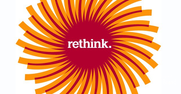
Despite the logo trying to look as if it’s going at 100 miles per hour, it is static. Despite the logo trying to look as if it’s organic and natural, it is a standard-issue computer logo. There is a heavyness to the logo that restricts it from achieving what the designers wanted. If it’s meant to be paper, that is like 300-pound weight. If it’s meant to be saw blades, that is going to be one blunt cut. Having “rethink.” stuck in the center doesn’t help either, and I hope it goes away eventually, because it looks uncomfortably tight there in the center. And the typography has nothing to do with the logo, with paper, or even a twenty-first century brand. If the name is “Stora [space] Enso” I find the upper-yet-lowercase “E” totally useless. In the previous logo, although it ate the space, at least it was clear there were two words. I’m probably coming down too hard on this logo, as it may not be that offensive, but it just hits too many notes the wrong way for me.


